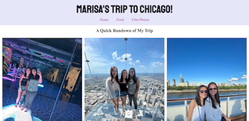
Click to visit my website for Project One!
I definitely struggled at first with this project and had doubts that I could create a decent website. Ultimately, I got a little lost at some points but I was very proud of what I was able to code by hand! I got to use a lot of the skills I learned from class assignments and Free Code Camp. If I couldn't figure anything out, I was able to look online to find answers or ask questions in class for help. One of the biggest things I learned was how to tinker around with flexbox to help organize my content and create a structure. I also got to reinforce my skills with HTML organization and CSS styling.
I'm very proud of the aesthetic of my website and how I was able to format everything. I like the clean and simple look that I created with the banner and the layout of my content. The flexbox elevated the structure of the photos and text. It took me a while, but I was able to figure out how to restructure the flexbox in order to compensate for screen size, but still keep the photos easily viewable. In the future, I would like to figure out how to further stylize my page and also bring some fun elements into the look. I would also like to learn how to build a photo gallery to change the viewing experience.
